 Sydney Young Portfolio
Problem
I was teamed up with a group of 9 other designers from around the country and was tasked with designing a Spring/Summer 2026 line and campaign for either the Abercrombie & Fitch or Hollister brand. We had just under 48 hours to come up with an idea, create our designs, and put together a presentation to present to an executive board at the company.
Ideation
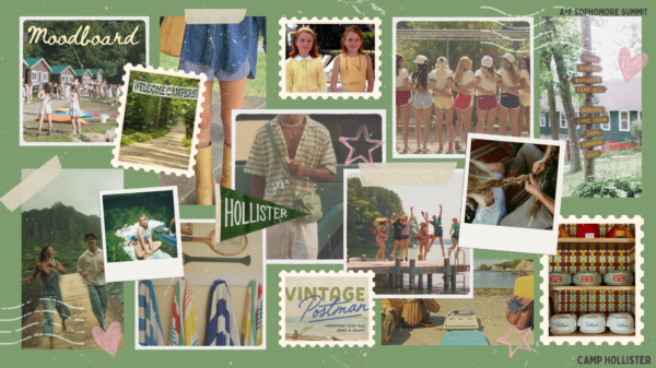
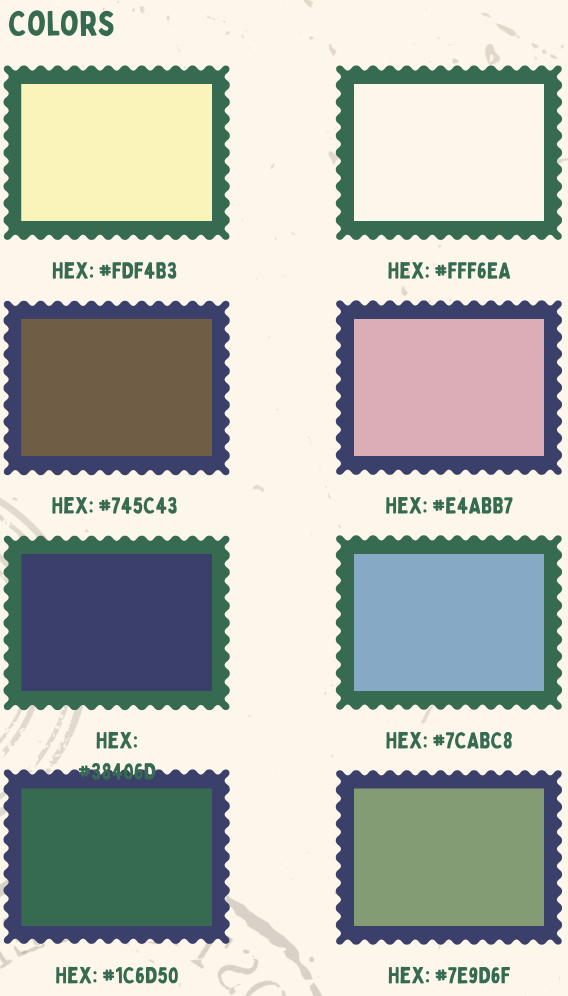
As a team, we began by brainstorming different line ideas and landed on the idea of Camp Hollister, a romanticization of summer camp and spending the entire summer with your friends. Next, we all collected imagery to create a collective mood board and color palette. This allowed us to decide on a consistent style and ensured we were all designing with the same idea in mind. After this, we split up into smaller teams. The fashion designers worked on creating the clothing items and outfits that would be featured in the line, and the graphic designers worked on graphics that would be used for some of the designs, as well as how we would market the line.
My Designs
Patch Designs
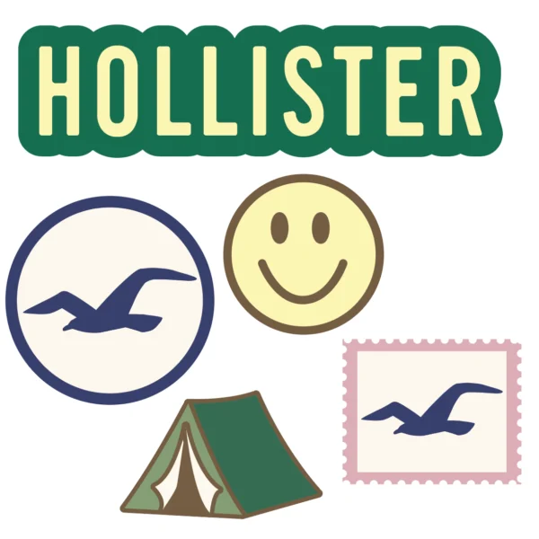


I started off by helping design some patches that were going to be a large part of the line. I came up with a few ideas that incorporated classic Hollister imagery, but also wanted some that played with the camp theme. I created them in Illustrator, and then we picked our favorite designs from each designer. The chosen designs were then put into Photoshop to give the effect that they were embroidered patches.
Brand Guide
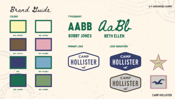
Next, I worked on creating a simple brand guide. This helped us ensure that everything was consistent and looked cohesive, as we had multiple people working on different elements simultaneously. It also allowed us to have a resource to refer to in case we needed a specific color or wanted to find out which fonts we had been using.
Website Landing Page
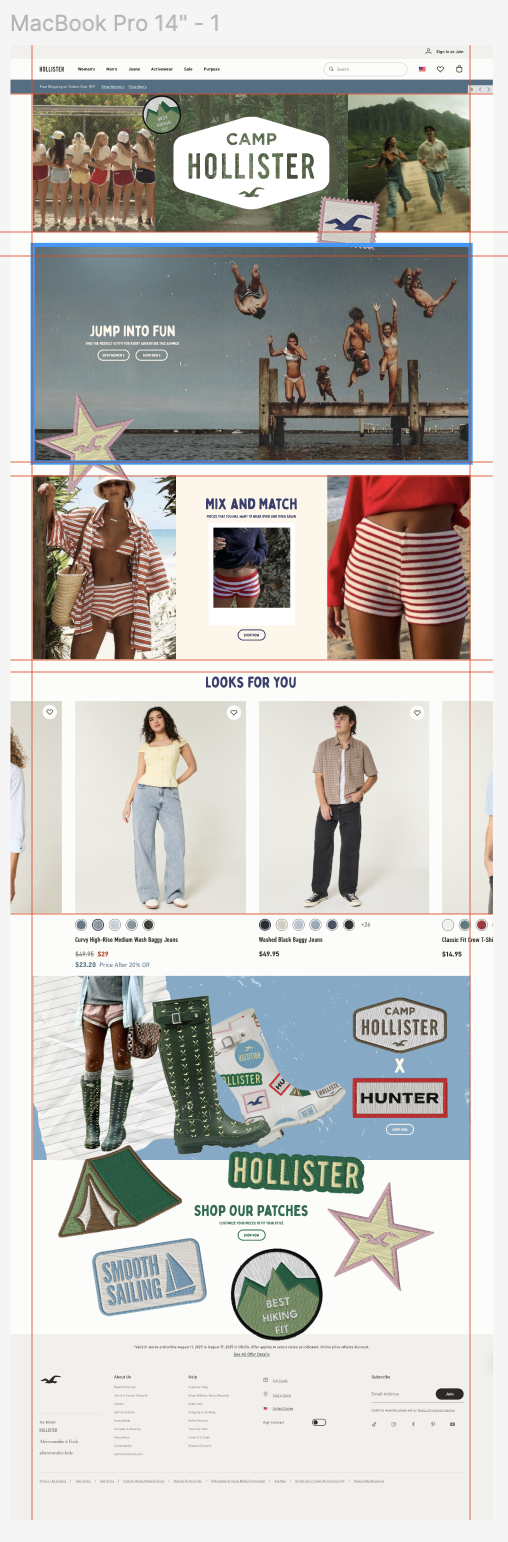


My next job was to create a scrolling mockup of what the Hollister website landing page would look like during the Camp Hollister campaign. I created the page on Figma, making sure to include the actual header and footers of the Hollister website and keeping consistent with the look of the real website. I wanted to make sure that I emphasized ideas that were important to our line when creating the landing page. This is why I made sure to include a whole section on mixing and matching pieces, because a big part of summer camp is finding multiple uses for the limited pieces you are able to bring with you. I also wanted to make sure the patches we designed were scattered throughout the whole design since they are a repeating motif in our line.
Final Presentation

Next, we combined all of our work into a presentation that we would then present to a board of A&F Executives. To make our presentation more engaging, we developed the story of Olive and Noah, two campers at Camp Hollister, and their love story that takes place throughout the summer. This allowed us to explain how our line fits in seamlessly with their life and the idealized camp experience. The presentation includes everything from our mood board to the technical flats to the packaging and store displays.