 Sydney Young Portfolio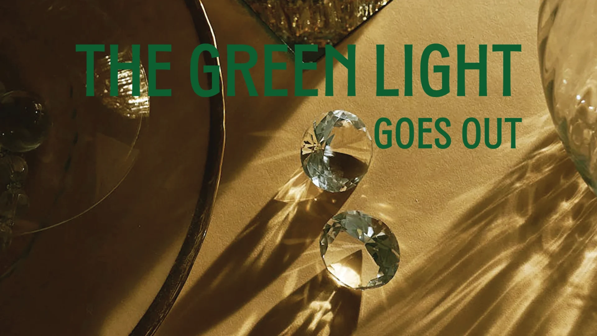
Problem
For this project, I was tasked with creating a 10-page spread for an extension of a story of my choosing. In class, we learned how to use AI to create copy for our stories, so I had it write me an alternative ending for The Great Gatsby if Gatsby never died. I then used this story to design the layout and collect imagery.
Ideation
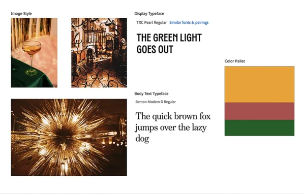
I started by creating a style board. I carefully chose the images to help represent the style of images I wanted to use for my layout. I wanted the images to consistently have a gold color, not only to help unify them but also to portray the luxury that exists in Gatsby’s world.
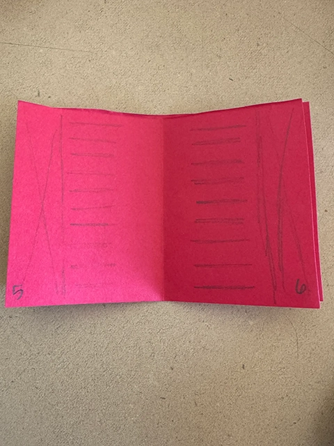
After I created the style board, I built a mock booklet so I could sketch different layout ideas. This allowed me to see how the two pages would look next to one another and quickly work through ideas.
Design Process
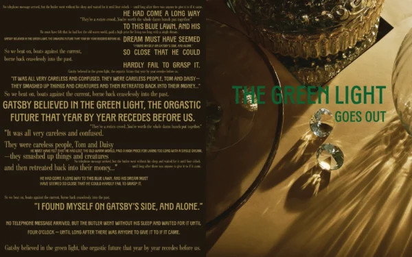
When I started in InDesign, I created the cover first since it would set the tone for the rest of the layout. I wanted the left side to be a jumble of quotes from the end of the original book to set the tone that this story changes the ending. On the left, I wanted it to be a picture that would set the style for the pictures in the rest of the layout. I chose this one because of its strong gold color and the abundance of luxury it portrayed with all the crystals.
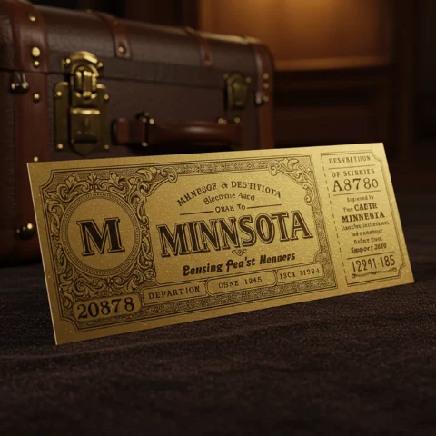
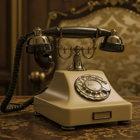
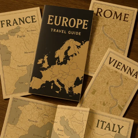
Next, I began to collect images for the rest of the layout. For the images, we were also allowed to use AI to generate specific ideas we needed. This allowed me to have an art director role similar to if I were working with a photographer. I tried to find close-up images of objects or spaces mentioned in the story so I could just show glimpses of everything to leave room for readers to fill in the rest. It also adds to the mystery that is a common theme in the original book.
However, I ran into the issue of getting all the gold colors to match in each generated image. So I put all of the images into Photoshop to edit the colors so they would all match.
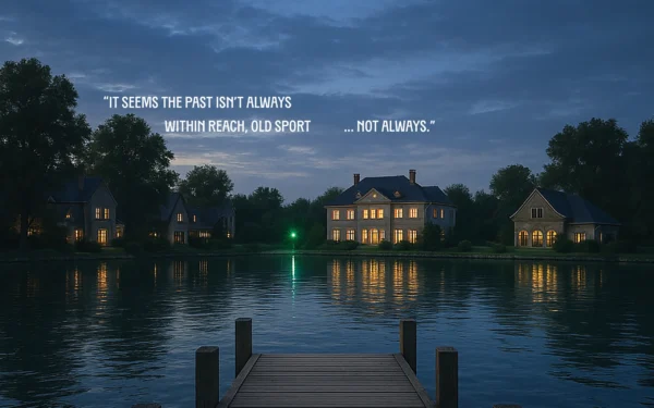
Part of the project requirements was to have a 2-page spread image. For this image, I wanted it to contrast with the others and be further away since it took up so much more space than the other images. I also included a pull quote that I felt summed up the original story, but was also true for the alternative ending.
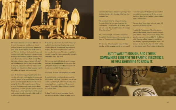
When working on the rest of the spreads, I paid close attention to the spacing of the images and pull quotes because I wanted them to have enough space to breathe and give the feeling of excess, which adds to the luxury of the story. I also had the images that flowed horizontally onto the page opposite it to make the spreads feel like they were one and not just two pages next to each other.
Final Design
Here is the full 10-page layout. I recommend changing the view to “Two page view” to see the full design.